Disease Similarity Maps: A Visual Resource for Researchers
Discovering Overlapping Mechanisms with Disease Similarity Maps
Understanding the molecular relationships between diseases has never been more critical. With the explosion of omics data, we are now able to uncover not only what makes a disease unique — but also what it might share with others.
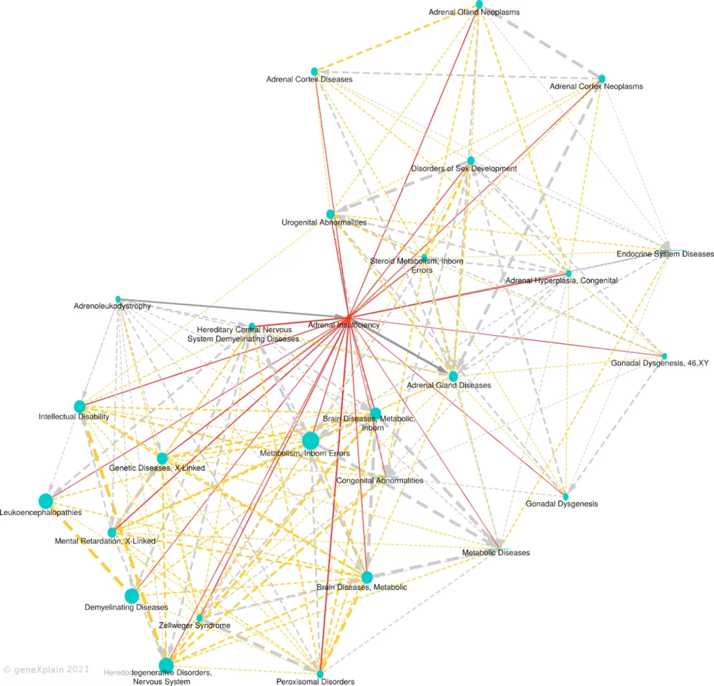
One powerful way to visualize these relationships is through a Disease Similarity Map, available as part of the HumanPSD™ database within the TRANSFAC DISEASES Package.
In the age of complex, multi-factorial diseases, recognizing that no disease is an island is key. The Disease Similarity Map helps us step beyond isolated thinking and move toward an integrated understanding of human health.
What Is a Disease Similarity Map?
A Disease Similarity Map is a network-based visualization that connects diseases based on their shared causal biomarker genes. These connections reveal overlapping molecular mechanisms that may not be evident from phenotype alone — offering new opportunities for:
A disease network derived from these relationships organizes disease entities into clusters with apparent biomedical relevance. Several inferred associations coincide with known clinical correlations such as comorbidities or disease etiologies.
To account for unequal gene occurrence frequencies, for each disease an expected overlap with a randomly generated set of causal genes was estimated as a function of the gene set size (Stegmaier, et al., 2010).
Learn more: https://genexplain.com/disease_similarity/disease_analysis_docs.html

Edges are shown for FDR < 0.05 and overlap size ≥ 2. The primary disease appears as a red diamond, neighboring diseases as blue circles. Solid edges link the primary to neighbors; dashed edges link neighbors to each other. Gray arrows show parent-child relationships from MeSH. Red/orange edges represent similarity-based links. Edge width reflects statistical significance, and node size reflects the number of causal biomarker genes.
How to Read the Map
The primary disease of interest is placed at the center of the map and represented as a red diamond. Other diseases that share statistically significant molecular features appear as blue circles, forming a constellation of mechanistic similarity.
The Disease Similarity Map uses multiple visual cues:
This structure reveals biological proximity and helps trace hierarchical and mechanistic relationships across the disease landscape.
Why It Matters for Biomedical Research
Disease similarity maps allow researchers to explore how their experimental data aligns with known disease mechanisms — offering context and interpretability.
The Disease Similarity Map highlights:
By focusing on causal biomarkers, rather than just correlation, these maps reveal biologically meaningful connections relevant to translational and clinical research.The map is generated using data from:
– HumanPSD™ – a manually curated database with over 123,000 gene-disease assignments
Disease Biomarkers: License Required
The HumanPSD(™) database includes four biomarker classes — Causal, Correlative, Negative, and Preventative — that define a gene’s role in a disease. The similarity maps link diseases based on shared causal and preventative biomarker genes.
Please note: The list of disease biomarkers is available through the licensed TRANSFAC DISEASES package.
You can find more details about the package here
or email us at [email protected] for a quote.
