Extraction of disease-gene network
A causal disease-gene network is gathered from the complete human disease biomarker collection of the HumanPSD by selecting associations of the types Causal and Preventative as well as Correlative associations with the attribute Disease mechanism. The network is further restricted to diseases with at least five causal genes connecting over 850 diseases and more than 7350 causal genes.
Sampling of random causal gene sets
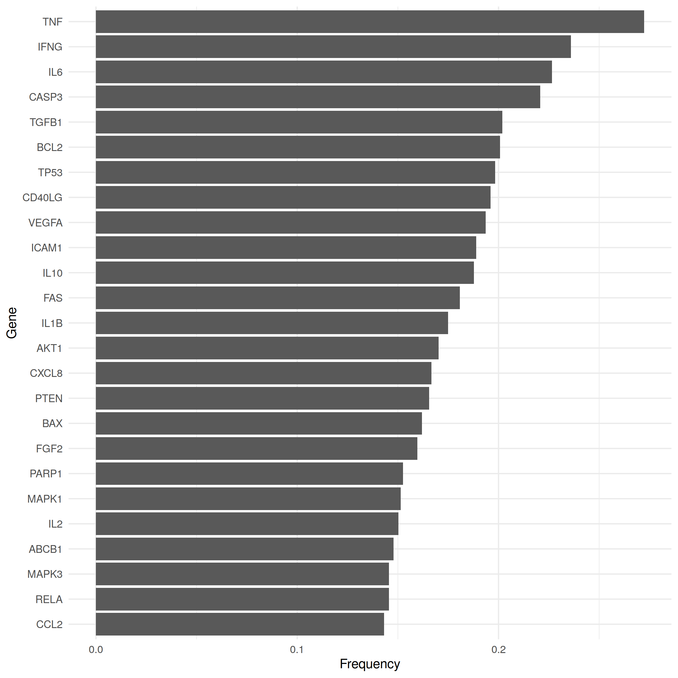
Classical hypothesis tests like the binomial or the Fisher test are at our disposal to assess the statistical significance of the number of shared causal genes. However, the underlying distributions assume that samples (of the same size) are drawn with equal probability, whereas we observe that occurrence frequencies of causal genes within disease gene sets can differ strongly thereby violating that assumption. The 25 most frequent causal genes of our data set are shown in Fig. 1 together with the proportion of diseases with which they were associated. While some causal genes are associated with only a handful of diseases, others like TNF, IFNG or TGFB1 played a role in every fifth to almost every third disease type. Therefore, diseases linked to the more frequent genes are more likely to share causal genes with other diseases.
To account for unequal gene occurrence frequencies, [1] estimated for each disease the expected overlap with a randomly generated set of causal genes as a function of the gene set size. The expected overlap estimated with this function was then applied as parameter of the Poisson distribution to compute the statistical significance for an observed number of shared causal genes:
$$P(X \geqslant x) = 1 - e^{-\hat{\lambda}} \sum_{0 \leqslant k < x} \frac{\hat{\lambda}}{k!}$$
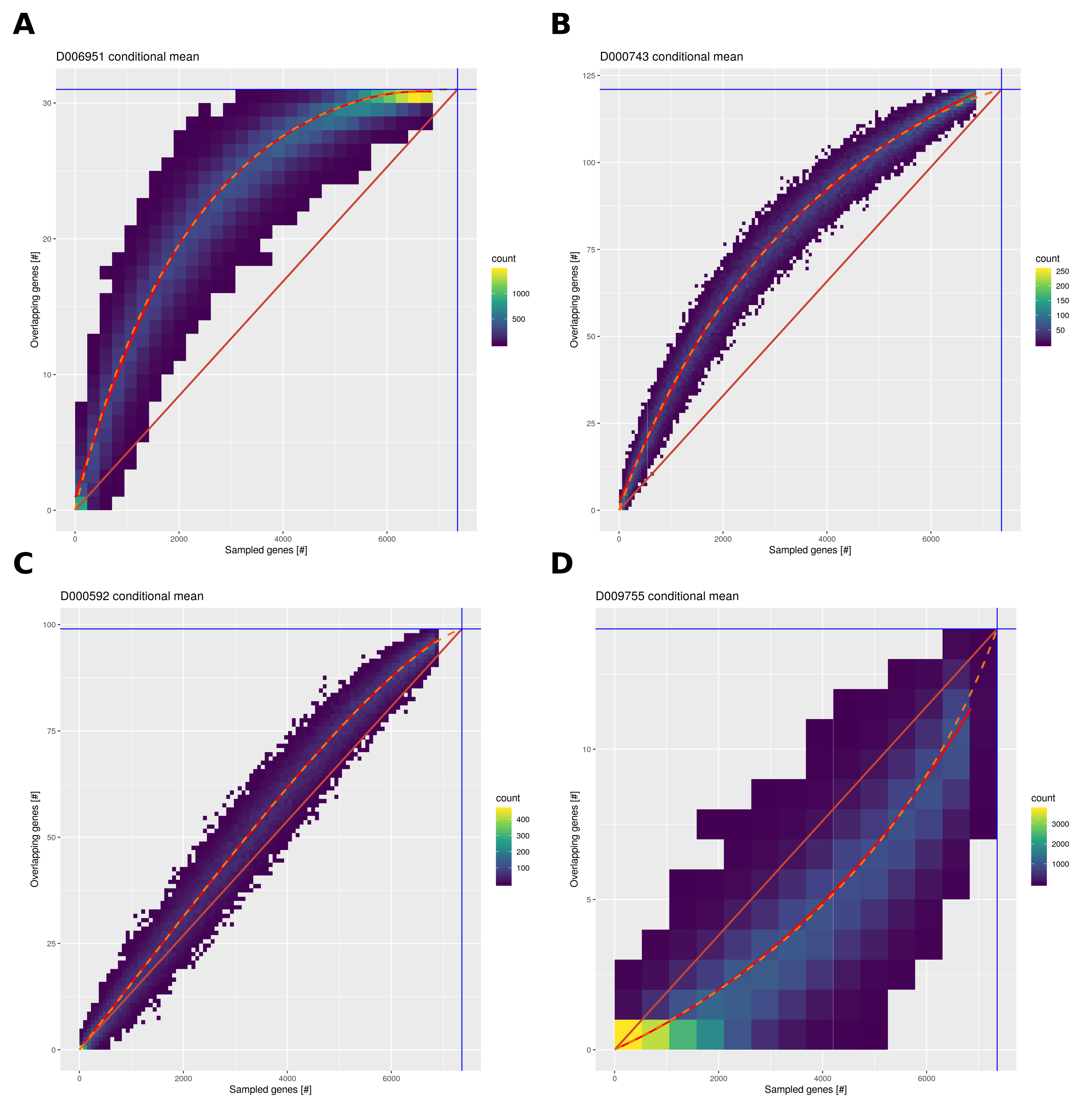
Several improvements were applied for the HumanPSD reports. The sampling process was adapted to better cover the range of possible causal gene sets from 5 to 7000 genes allowing for improved modeling of expected overlaps and gene set sizes. Instead of using linear regression, conditional mean overlaps were fit using Bézier curves to accommodate different shapes of the gene set size/overlap function as well as to adhere to theoretical bounds imposed by minimal and maximal gene set and overlap sizes. Figure 2 exemplifies random gene set and resulting overlap data for four diseases. Please see figure caption for details.
Pairwise disease-disease comparison
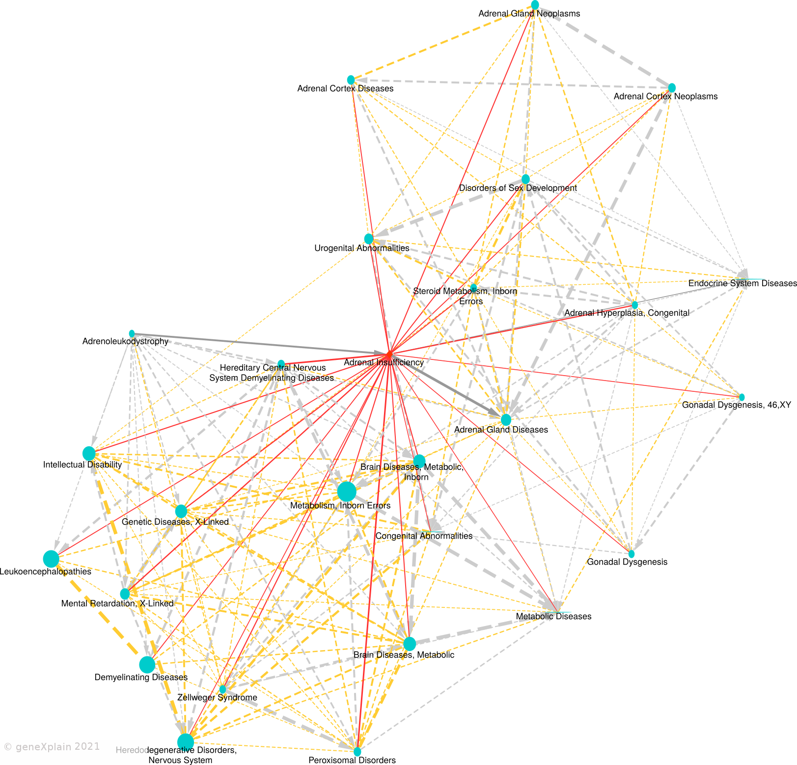
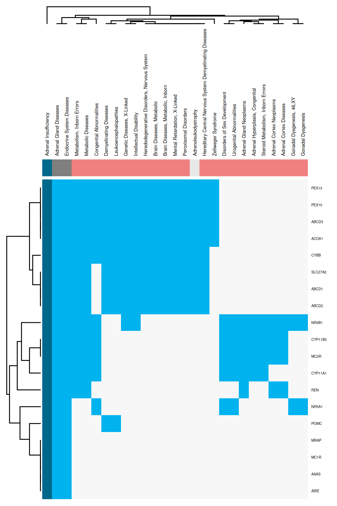
The obtained regression models are applied to calculate a similarity between all disease pairs. The HumanPSD disease reports present for each disease the set of diseases with at least two shared causal genes and an overlap false discovery rate (FDR) below 0.05. FDRs are estimated by using the R p.adjust method with method = "BH". We denote the set of significantly similar diseases defined by certain similarity thresholds as disease vicinity. Within a Disease Report, the disease vicinity information is provided as table which contains columns with names of neighboring diseases (Disease), the MeSH ID (MeSH ID), a description whether a disease is also parent or child within the MeSH hierarchy (MeSH relationship), the number of shared causal genes (Overlap (common biomarkers) and the FDR (Adjusted p-value). Besides the tabular view, disease vicinities are presented by a network plot as well as a heatmap co-clustering diseases and shared causal genes. Examples are shown in Figures 3 and 4. Please see figure captions for details.