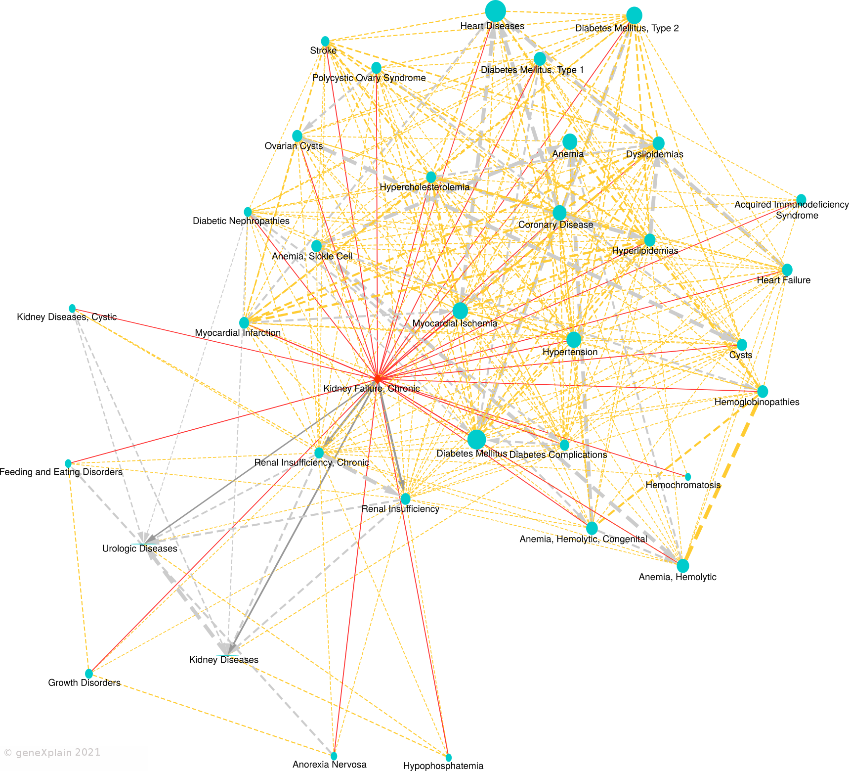
Disease similarity map:
Legend:
This Disease Similarity Map connects diseases (nodes) with edges on
the basis of common causal biomarker genes (edges are shown for FDR < 0.05 and overlap size >= 2). The primary
disease is represented by a red diamond shape, neighboring diseases by blue circles. Solid edges connect the
primary disease to neighboring diseases. Dashed edges connect neighboring diseases. Undirected solid red edges
connect the primary disease in the center with similar diseases (neighbors), undirected dashed orange edges
connect similar neighbors. Gray arrows point from a child disease to the parent disease according to the
MeSH hierarchy. Edge widths are proportional to the
statistical significance of association and node sizes are proportional to the number of causal biomarker
genes of the disease.